Case Study
Elevating the E-Commerce Experience
Product: Core Digital Retail Platform | Timeline: Multi-Day Design Elevation Sprint | Role: Lead Systems & Visual Designer
A multi-day design elevation sprint transforming core retail surfaces into a scalable, premium framework.

The Executive Summary & Challenge
The Context
The core web and mobile storefront experiences required a rapid visual and systematic elevation to better highlight key retail initiatives (such as seasonal campaigns and internal brand lines) while maintaining high usability.
The Friction
Fragmented navigation paradigms, inconsistent promotional banner behavior, and a desktop/mobile shopping experience that felt transactional rather than engaging.
The Objective
Run a high-velocity design sprint to audit, explore, and consolidate the core user journey—spanning discovery (Navigation, Homepage) to conversion (Cart)—into a highly polished, scalable visual framework.
Streamlining Platform Discovery: Navigation
The Exploration
Through collaborative sessions, we explored initial divergence in visual layouts, density treatments, and masking approaches for category imagery. Multiple conceptual directions were workshopped to understand the design space.
The Convergence
We consolidated our findings into unified Navigation Concepts, carefully structuring menu taxonomies to draw customers' eyes naturally to key store departments and digital aisles without causing cognitive fatigue.
Key Achievements
- Unified mega-menu structure reducing cognitive load
- Responsive category imagery masking for mobile & web
- Improved visual hierarchy for primary vs. secondary navigation
Digital Merchandising & The Storefront
The Challenge
The homepage needed to serve multiple masters—featuring prominent seasonal activations and corporate brand priorities, while remaining fast and intuitive to browse.
The Progression
Rapid iteration cycles refined the design across multiple days, exploring grid density, promotional placement, and visual hierarchy. Each iteration brought us closer to a premium, cohesive storefront experience.
Final Vision
The consolidated homepage redesign balances commercial priorities with aesthetic excellence. Promotional assets feel natively integrated, and color theory choices ensure seasonal campaigns feel cohesive rather than visually jarring.
Scalable Frameworks: Components & Banners
The Banner Framework
We established rigorous rules for typography scaling, padding, and responsive behavior across web and mobile viewports. This framework enables rapid iteration while protecting brand consistency.
Local Component Architecture
Atomic elements (buttons, badges, micro-copy blocks) were built with strict constraints to protect brand integrity across diverse promotional contexts. This design system approach ensures consistency at scale.
Benefits
- Reduced design iteration cycles for marketing teams
- Engineering clarity through precise component specs
- Brand consistency across all promotional contexts
- Scalable framework for vendor-created content
Refining High-Intent Touchpoints: Cart & Polish
The Cart Overhaul
The cart page was meticulously refined to clearly surface order summaries, fulfillment options, and cross-sell opportunities. Every element was optimized for conversion while maintaining visual clarity.
Sweating the Details
High-resolution refinements included subtle UI treatments—drop shadows, micro-interactions, active states, and precise typographic hierarchy—that elevate the interface from standard utility to a premium digital flagship experience.
Attention to Craft
Every pixel serves a purpose. From button hover states to color contrast ratios, the polish phase ensured the experience felt both premium and accessible.
Strategic Alignment & Impact
The Deliverable
We unified the final output into a definitive presentation deck, securing executive alignment and providing clear visual specifications for engineering teams.
The Takeaway
Executing an intentional "elevation sprint" format successfully accelerated alignment, established a new benchmark for cross-functional design quality, and unified the product ecosystem under a single, cohesive visual language.
Key Learnings
- Time-boxed sprints drive faster convergence on design direction
- Component systems enable sustainable scaling
- Cross-functional alignment requires clear visual specifications
- Incremental polish compounds into premium experiences
More Work

Design Systems × AI
Design System Documentation
Using AI to materialize constraint spaces so designers have time for meaningful conversations.

E-Commerce × Mobile
My List at Albertsons
From KTLO mode to a +4% engagement lift — a two-phase redesign of the List surface.

Internal Tool × Albertsons
Image Cropper Tool
AI-powered batch image processor with automated focal point detection.
Marketplace × Local
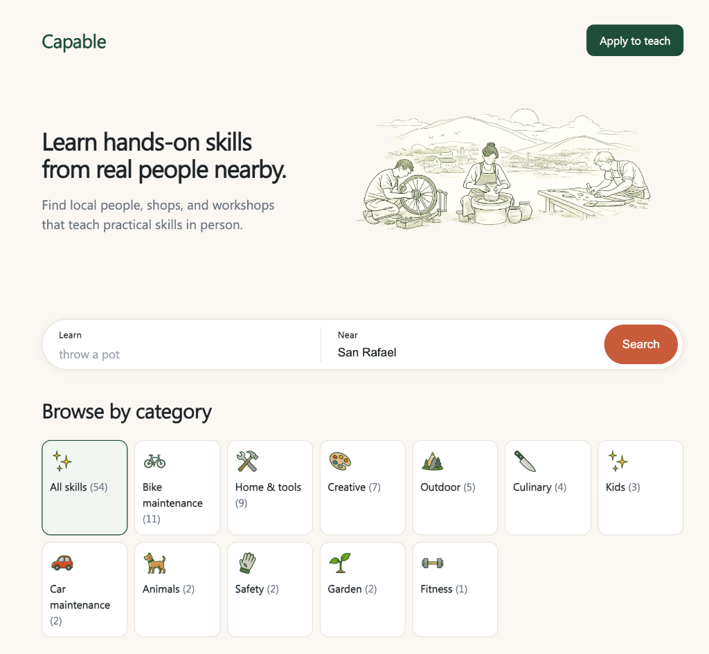
Capable
A free, skill-first directory of local, in-person, hands-on classes — and the early signals that real people want it.

Brand & Web Strategy
JP Events
Microcopy-led redesign for a South Asian wedding planning firm.

Mobile Web
storr
Social commerce platform focused on connecting buyers with people.

E-Commerce
Beauty Box
Subscription box landing page and onboarding for Macy's.

iOS & Android
Mobile Checkout
Scan items and complete purchases directly within Macy's mobile app.