Macy's Credit Card Acquisition
My Role
UX Designer
Company
Macy's
Platform
Web (Desktop & Mobile)
Overview
The Macy's Credit Card is a key driver of customer loyalty and repeat purchases. However, the acquisition page was underperforming, with usability issues preventing potential customers from completing applications.
My role was to redesign the credit card landing and application pages to improve user experience, reduce confusion, and ultimately increase credit card sign-ups.
The Challenge
Users were landing on the credit card page but not completing applications. Customer support was receiving calls about confusion around the discount offer and card benefits. The existing design had several issues:
- •Benefits were buried below the fold and not immediately visible
- •The discount offer language was confusing and led to customer disappointment
- •Form fields were unclear and generated support calls
- •Visual hierarchy didn't guide users through the application process
Research & Insights
I worked closely with the customer support team to understand common pain points. The most frequent issues were:
Discount Confusion
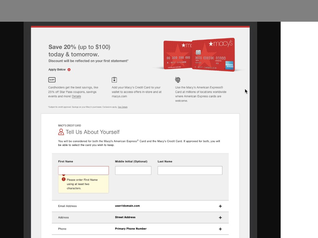
"Save 20% up to $100" was being interpreted as a flat 20% discount with no cap, leading to disappointed customers at checkout.
Hidden Benefits
Users didn't realize the card offered more than just a sign-up discount. Additional perks weren't visible without scrolling.
Key Insight: Users needed to see the value proposition immediately and understand exactly what they were getting before starting the application.
The Solution
I redesigned the page with three key improvements:
Made Benefits Immediately Visible
Moved all card benefits above the fold with clear iconography and concise copy.
Clarified Discount Language
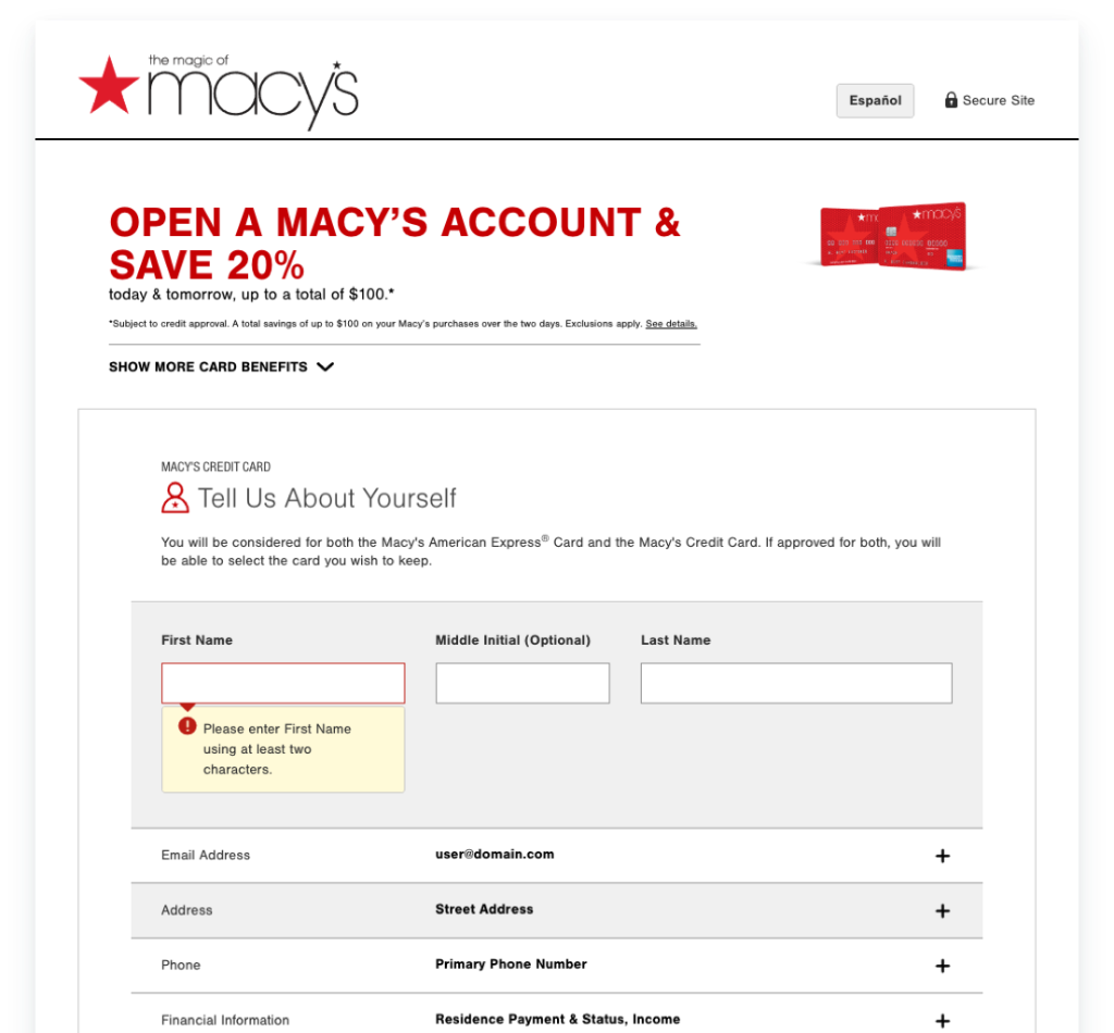
Rewrote the offer to clearly state "today & tomorrow, up to a total of $100" to set accurate expectations.
Streamlined Form with Better Guidance
Improved form field labels, added helpful tooltips, and used progressive disclosure to reduce cognitive load.
Design Decisions
Benefits Prominence
Instead of hiding benefits in accordion menus or below the fold, I created a clear visual hierarchy that showcased:
- →Cardholder savings and Star Rewards program
- →Online account management through macys.com
- →Global acceptance with American Express partnership
Discount Communication
The previous messaging "Save 20% (up to $100)" was ambiguous. I advocated for clearer language: "today & tomorrow, up to a total of $100" which precisely communicated the offer structure and timeline. This significantly reduced customer service calls about discount confusion.
Form Optimization
I simplified the form layout, grouped related fields, and added inline validation. The redesign also included a progress indicator so users could see how many steps remained in their application.
Constraints & Considerations
As with any large retail organization, there were business and technical constraints:
- •Legal Requirements: All credit card offers required specific disclosures and fine print, which needed to be visible but not overwhelming
- •Brand Guidelines: Designs needed to align with Macy's existing brand system and visual language
- •Technical Limitations: The application form integrated with third-party credit processing systems that had specific requirements
Future Improvements
While the redesign addressed immediate pain points, there were additional enhancements I proposed for future iterations:
Smart Form Pre-Population
For logged-in users, pre-populate known information like name, address, and email to reduce friction and completion time.
Dynamic Eligibility Check
Allow users to check their pre-qualification status before starting a full application, reducing abandoned applications.
Key Takeaways
🤝 Cross-Functional Collaboration is Critical
Working closely with customer support gave me insights I wouldn't have discovered through analytics alone. Their frontline experience revealed the true user pain points.
📊 User Research Drives Better Decisions
Data showed where users dropped off, but qualitative research explained why. Understanding the "why" was essential to crafting the right solution.
✍️ Words Matter as Much as Design
Clearer copy around the discount offer had as much impact as visual improvements. Good UX writing is inseparable from good design.
🎯 Small Changes Can Have Big Impact
Moving benefits above the fold and clarifying one sentence reduced support calls significantly—proof that you don't always need a complete overhaul to improve user experience.